Ambiguous Logo Case Study
Prompt: A logo for a cafe through the eyes of beat poet Bob Kaufman
Photos:


Facts:
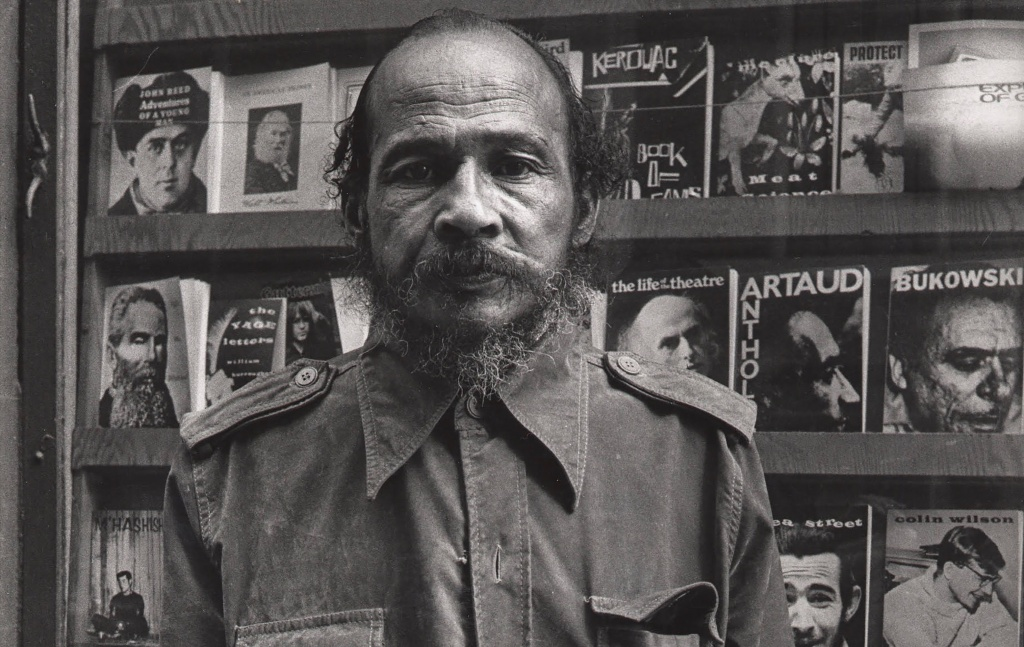
-Bob Kaufman was one of the founding members of the beat poetry movement in San Francisco. It was a literary subculture that explored aspects of post-war America through non-conformity, surrealism, and jazz stylings.
-Kaufman spent much of his young adulthood on freight ships, serving as a cafeteria worker, traveling across the globe.
-Kaufman had many run ins with the police, who would often target him. He was jailed several times. He said the term "beat poet" came from the fact that the police use to attack him and other poets around San Francisco.
-Kaufman took a decade long vow of silence after John F Kennedy was assassinated.
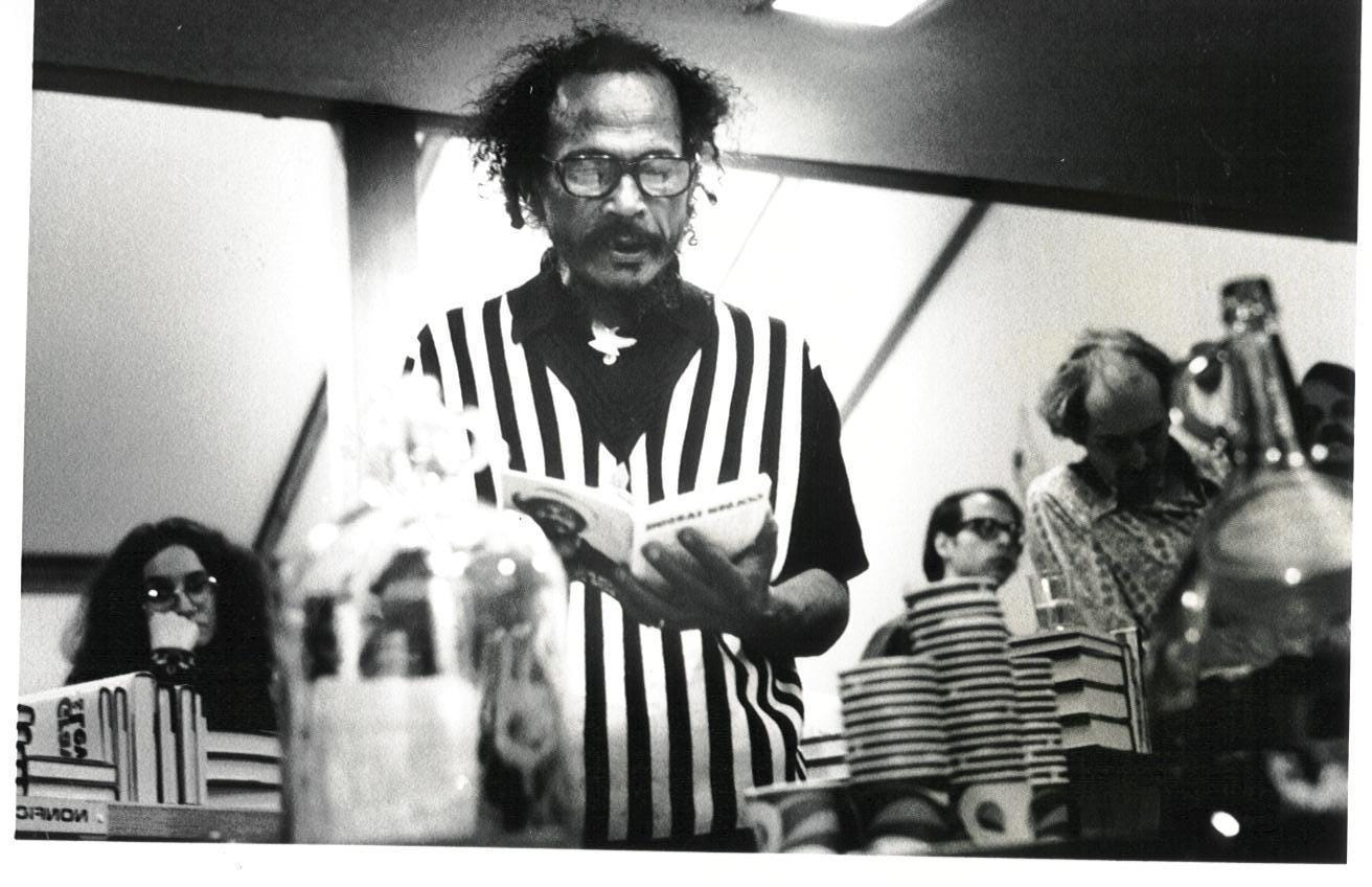
-Much of Bob Kaufman's works were never written down by himself. Instead, he would just memorize them, and read them aloud in public spaces. His wife Eileen made the effort to write most of them down.
-The first work of Kaufman's to be published was his manifesto by City Lights Publishing. Early on during his time in San Francisco, Kaufman often lived outside the City Lights bookstore. He submitted multiple works but they weren't published. He only got published after all his things were burnt in a fire outside the bookstore. His manifesto was the only thing that survived.
-Often, Kaufman's public readings would involve him going into a cafe, standing on a table, and reading his poetry aloud for everyone. This would then attract dozens more people who would show up to the cafe to listen.
-Kaufman was a union member. His participation sparked the attention of the FBI who harassed him throughout his life, including giving him experimental shock therapy.
-Kaufman lived in America for most of his life, but gained popularity in France during his life when one of his books was found in a second hand bookstore.
-When Kaufman died, people held a New Orleans style funeral for him that proceeded through the streets of San Francisco. His ashes were scattered into The Bay, where it's said a rainbow then formed overhead.
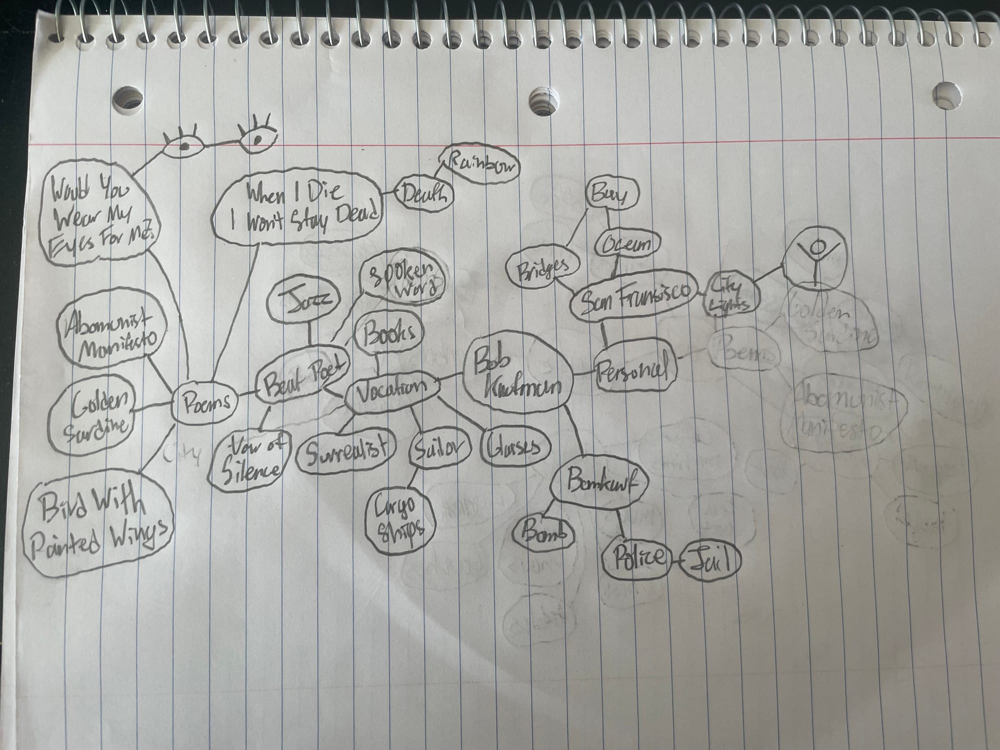
Mind Maps:
Bob Kaufman
Cafe
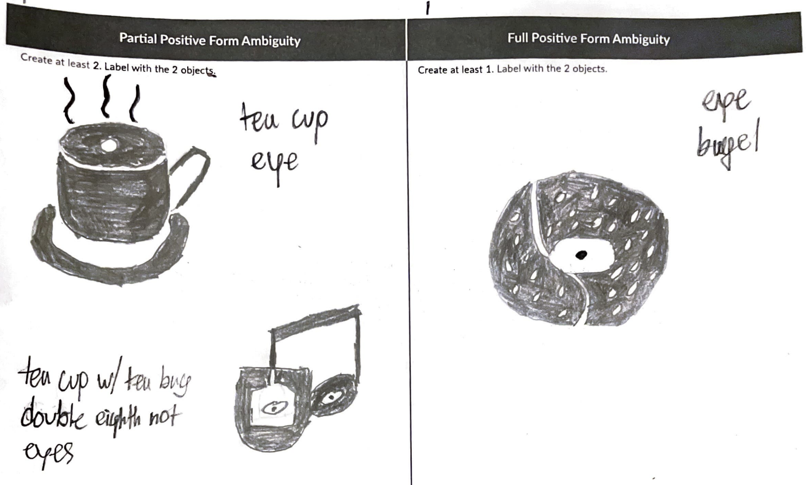
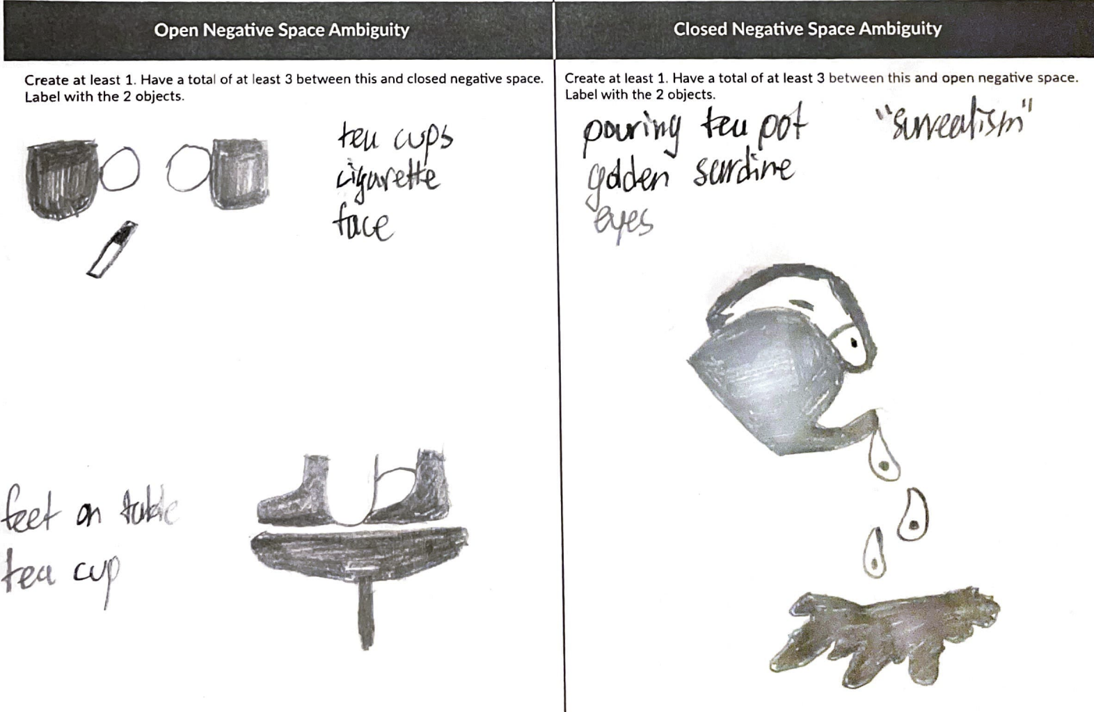
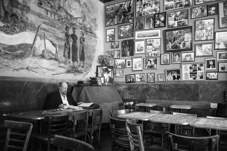
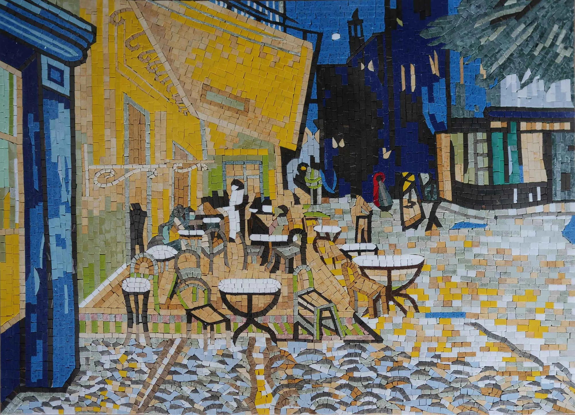
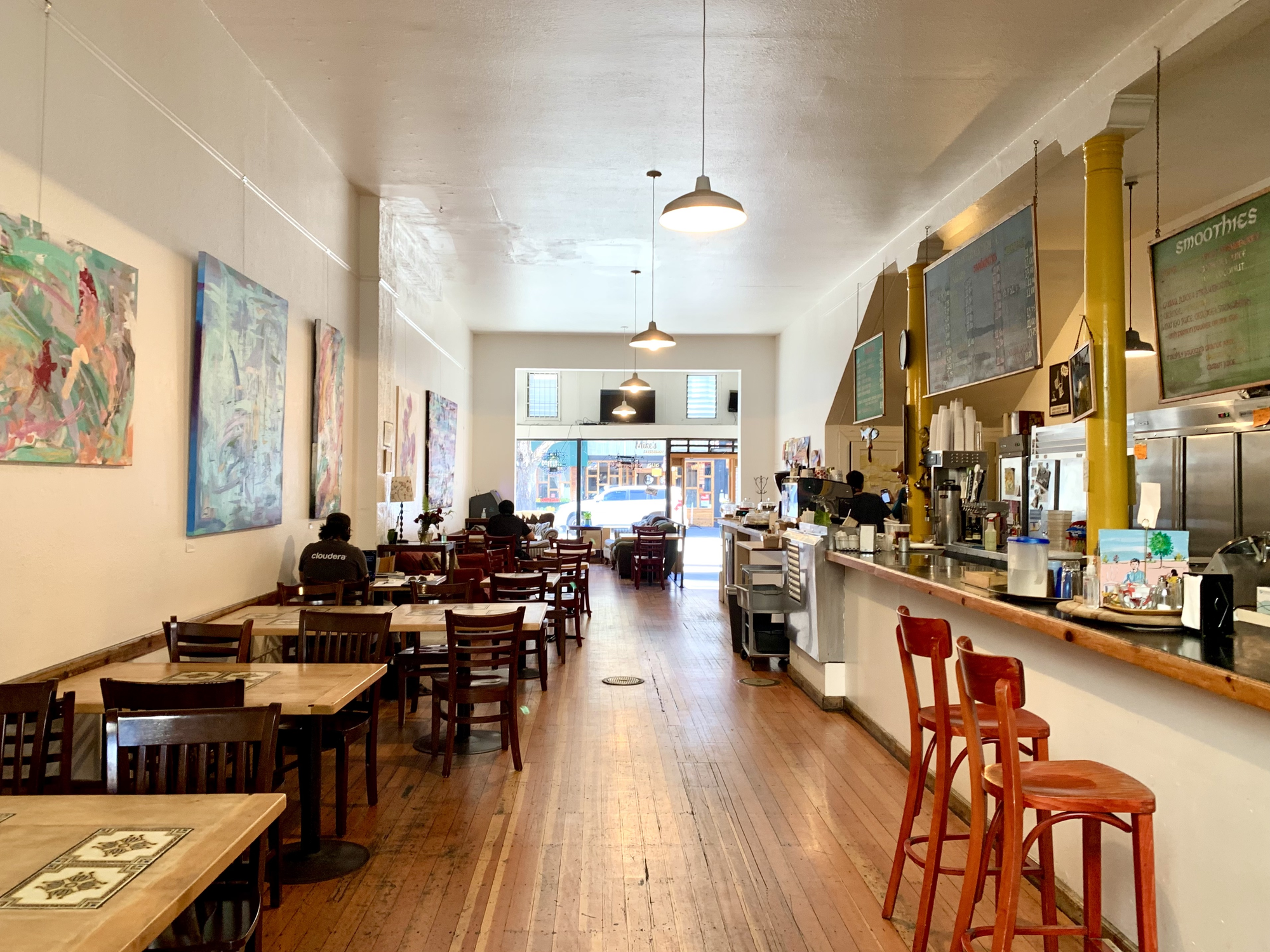
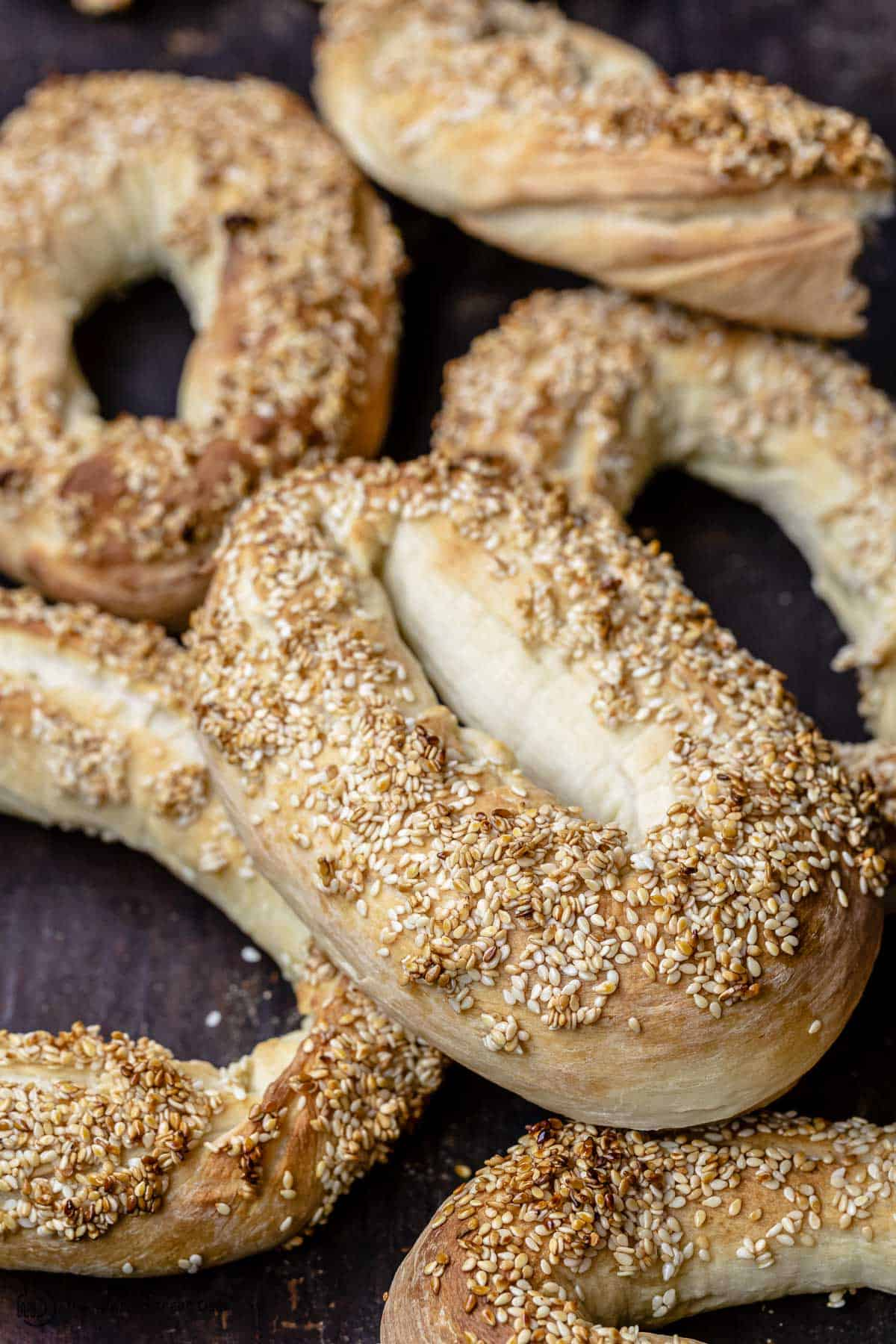
The options I made from the thumbnails included a combination tea cup and music eighth note, tea cups making a face, bagel as an eye, feet on a coffee, eye in a tea cup, and a golden sardine in a tea pot. The combination tea cup and music eighth note felt too busy and convoluted, with some aspects of the design not fitting into any resemblance. The tea cups as a face were trying to use gestalt principles to make the face, but it was just too vague and not that visually interesting. The eye bagel wasn’t very clear in what it was, having to use some lines to make it seem more like the contour of a face. The feet on the table idea I thought was really clever, but it felt like it wasn’t obvious that there was a tea cup there. I really liked the eye in a tea cup idea, and I think it worked well, but it did kind of feel like the obvious pick. The one I went with, and my favorite one, was the golden sardine in the teapot. The shape of the fish made up the empty space that separated the handle from the pot. This one immediately caught my eye, and I thought it fit most with a surrealist vibe with its shape, but I could also include the eyes as tea drops.



These are my iterations of the golden sardine tea pot in illustrator. I started out with having the fish wrap more around the teapot, kind of like it was leaping out of the water. I then also used the pen tool to give a waving motion in the tea pot because I thought it’d make it more dynamic. One issue with the placement of the fish was that it took away from the resemblance of a traditional tea pot. I was prioritizing the fish over the tea pot. I then inverted the fish to be upside down because the contours better fit the shape of the handle. In my critique I was told that the tea pot shape wasn’t obvious, and that I should move the fish negative space around more to better fit the shape of a handle, and make the tea pot a little more geometric so the resemblance was clearer. For the wordmark, the first font I found for the logo was called Barrio, and I immediately knew it was perfect. Everyone in my critique also said the same. It gives off the global coffee house aesthetic that I thought fit best for a beat poet cafe. I tried a couple other fonts that felt jazzy in a way, but they didn’t compare. Specifically phrasing the name as “Bob’s Cafe” kind of sounded like “Bob Kaufman” phonetically too, so I went with that as the title, even if it is likely the simplest name.
This is the final logo. I made it gold in color to fit with the golden sardine title.