
Deconstructivism Case Study
Here, I designed a poster using deconstructivist methods, to convey a message related to a social issue. We were encouraged to use unconventional type layouts, away from things like set grids, and to experiment with what we were doing visually and communicatively. For this project, I wanted to bring attention to the abundant misinformation on the internet, especially compared to just a decade ago, and evoke the feelings that it brings.
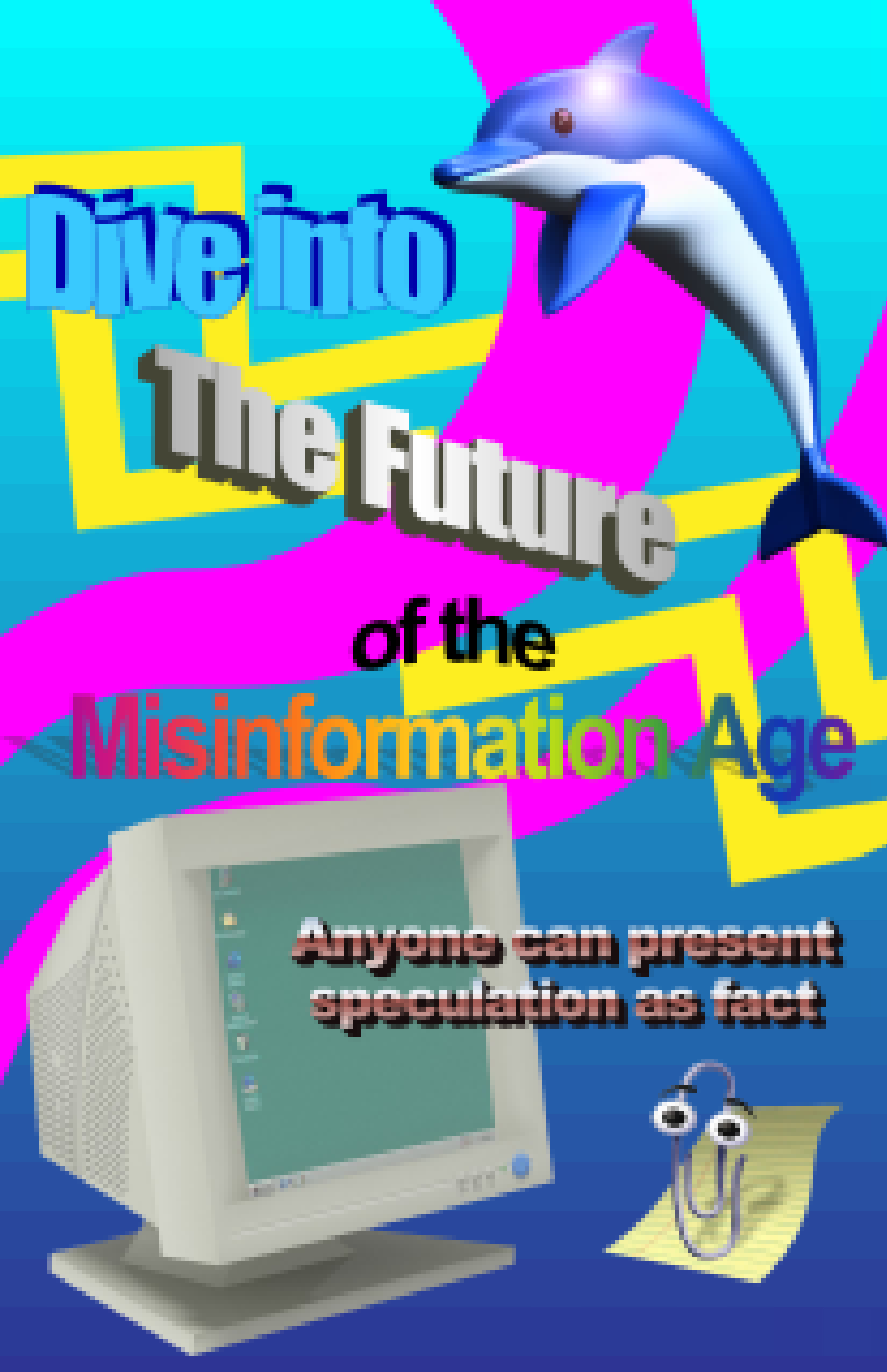
I went through two rough versions when conceptualizing this poster. This one with the 3D computer render and WordArt was generally my first idea. I was trying to draw on the optimism that people generally had with the internet when it was first becoming pervasive in everyday life. I wanted to twist that optimism into something more pessimistic and I thought it would be simple enough by adding the prefix mis- to make it the misinformation age which kind of says what the poster thinks is wrong and is trying to speak up on. It's that one small detail that should draw attention.
I had a lot of trouble conceptualizing what this rough would look like outside of the general idea. I tried to draw on Frutiger Aero imagery and aesthetics but I found it hard to work with the assets without knowing much about 3D design, and the overall vibe just wasn't matching. I stepped away from it and worked on the second rough for a while instead.
When I came back to it, I opted for a '90s aesthetic as the internet then was more innocent, and I could draw on some vaporwave imagery like the dolphin. I was also able to then incorporate WordArt into the transitional text layout, which felt more deconstructivist as many people classify WordArt as a graphic design crime with its overuse and how gaudy it looks.
I showed an earlier version of this poster to some people and it just felt too cutesy and too simple in terms of photoshop skills. To try to alleviate that I pixilated everything so it resembled how webpages would look with lower band dial up internet that couldn't carry as much storage. It also gave into the aspects of deteriorating imperfect forms, and exemplifying that. I also added Clippy at someone's suggestion just to fill more empty space on the page.
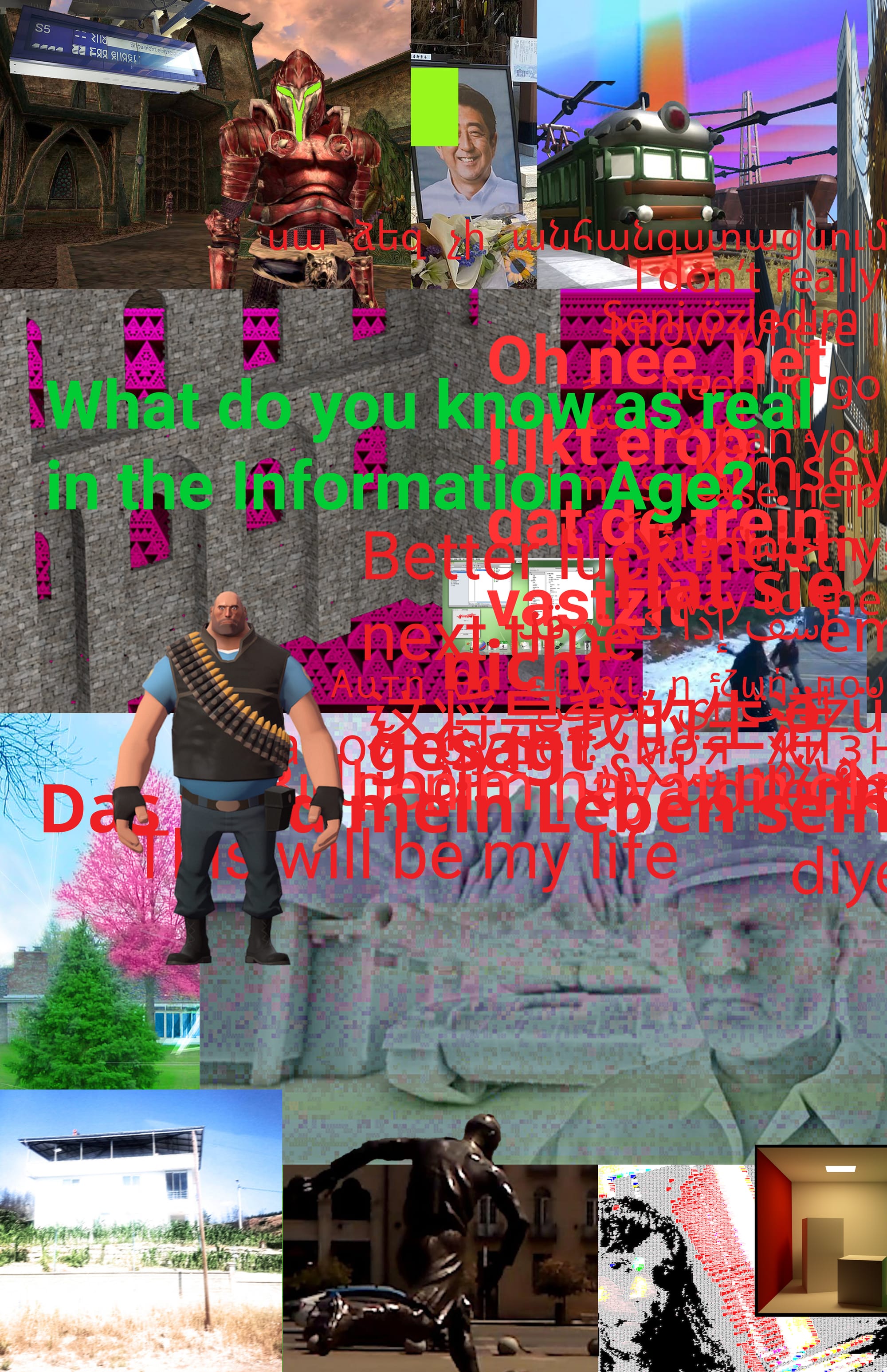
The other idea I came up with was for a glitched out sensory overload style poster. I thought it would be perfect for implementing a random text layout, as it would feel like if I computer went through, found a handful a random pieces of content, and then through them back out to you. I tried to make the images in the collage feel the same way, as if they were being sputtered out by a malfunctioning, glitching out computer.
I feel like this aesthetic fits well with my message about us being surrounded by misinformation whenever we even browse casually online. You can't tell what is real anymore. I wanted all the images and how they were overlayed with each other to feel like that in the sense that you got the impression of what things were, but you couldn't exactly tell what everything is. It's an onslaught of information. The random text, loose fragments of sentences in multiple languages, overlaid with each other also did this where it's hard to make out what anything says.
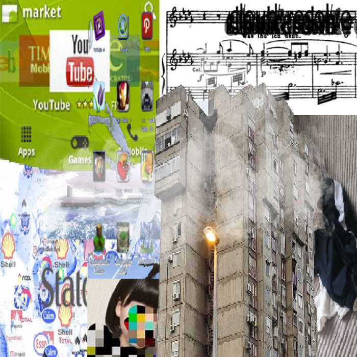
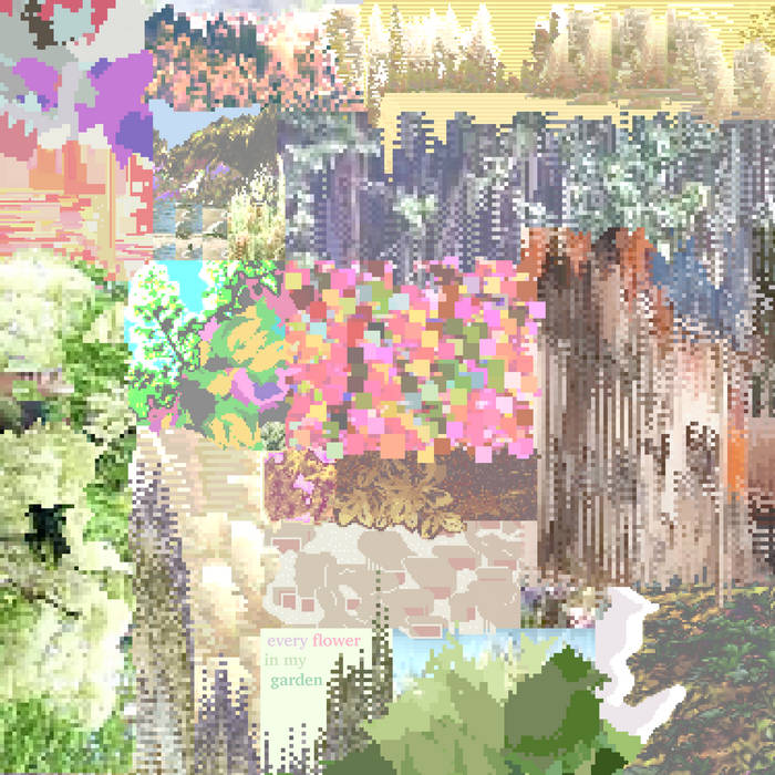
For the collage I was inspired by two album covers: "D:\fileDAeolian%20damage%20sequencer" by cloud:resolve and "every flower in my garden" by Lilien Rosarian. An image of Rosarian features in the collage in the bottom right. Both of these album covers match the music of Frutiger Aero digital sampled electronic music with cloud:resolve and the splendid cutie maximalist glitch ambient of Lilien Rosarian.
I found most of my images from Wikimedia Commons. So many of these images feel like they could only exist online with their low resolution and washed out colors. Other images come from YouTube videos or video games. I could explain why I choose each image if you want, but for right now that would take too long.
For the font, I tried to pick the most general sans-serif font that felt like it could be read on any web page. It resembles the one you're reading right now. I choose red for the text color because many error signs, like the ones in Source games, are displayed in that shade of red. For the main tagline, "What do you know as real in the Information Age?" I did the green as it was opposite on the color wheel to that red and feels more "valid" when you're trying to read it.
From my peer critique, people were split between which ones they liked more. At this point I had liked the glitched one much more, so I went with that one.
Those who like the '90s one liked the eras that it was referencing, and how it was a lot more welcoming in terms of understanding the message that it was trying to convey. Other people thought it was too simple and direct with what it was trying to say.
For the glitched one, people really liked the technical craft that went into it, while they were more divided on the imagery trying to deduce what it was supposed to mean or how it related to the message. Others liked the impression of it and how it felt. They also felt as though it could even use more glitchy aspects, specifically to hide the straight lines of the JPEG images.
The critique ended up being them asking more questions of me then giving out right feedback. When discussing them, I felt like I had more interesting things to say about the glitched one.
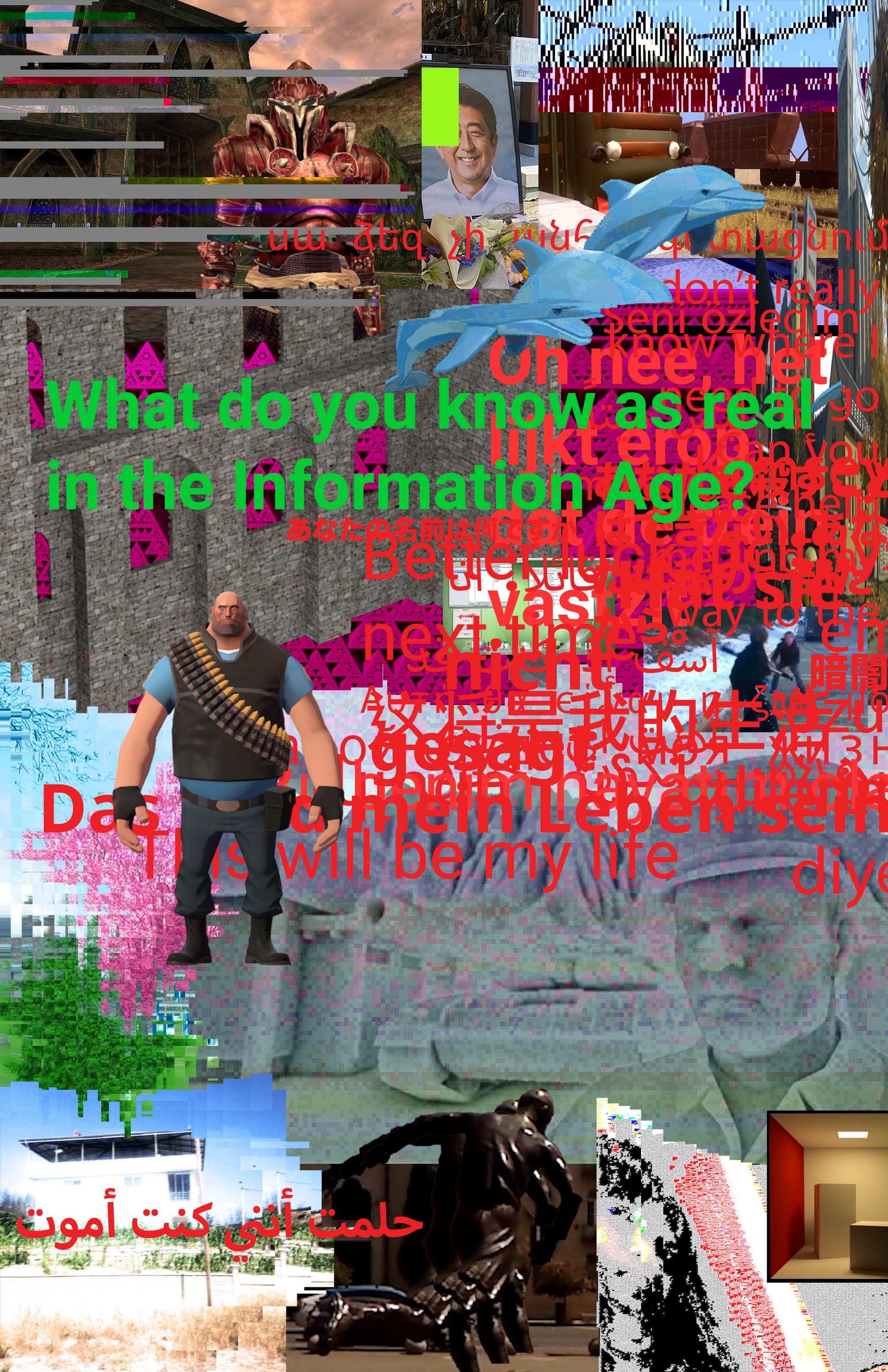
Originally, I had these mostly layered all over each other like they were browser windows that were opened, but that felt too static, and I emphasized the glitch aesthetic more. I added glitchy textures, cut things out and pieced with other parts to look broken, cut pictures up to look like they had scanline errors, and distorted images. I started playing with image file corruption to get those glitchy textures in a legit, non-simulated way. It was harder to work with, but it looked cooler, and gave it a more unsettling feeling. Towards the end I found a technique in photoshop that melted all the straight lines. I cut out the edges of the images that I wanted to bleed over, distorted them using square waves, and then overlayed them over the full image.
I'm really happy with how this turned out. I think it looks cool, and that's one of the most valuable things. There's a lot of photoshop technique that went into it, and I'm impressed with what new things I was able to figure out. My mind lights up with all the little references I was able to throw in there. Above all, I really like the overwhelming feeling that the images and text generate, and the mind-numbing uneasiness that brings, which I feel encapsulate what it's like the browse the internet anymore.