
Type Specimen Case Study
Definition:
Design an interesting, visually dynamic, and engaging poster that showcases the qualities of a specific font type, in this case Avant Garde Gothic, and gives information about its history and background.
Thumbnails:
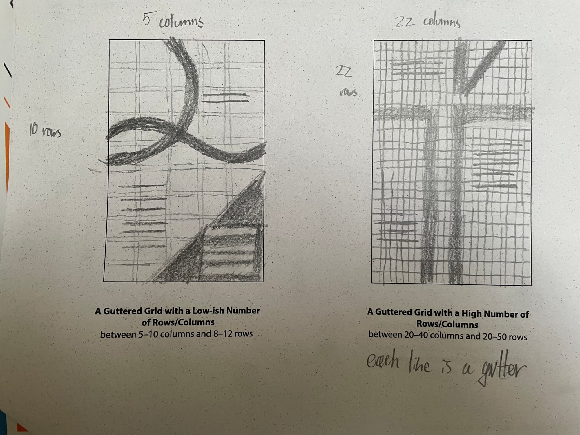
These are my four thumbnails. The first one is the one I used for my second rough that didn't get used in the final project. I really like how the Q looked in Avant Garde Gothic, and wanted to play with its qualities. The second one was the one with 20+ rows and columns and gutters, and it was too cluttered on the page when doing it by hand, so it was hard to work with. I decided it wasn't worth working with.
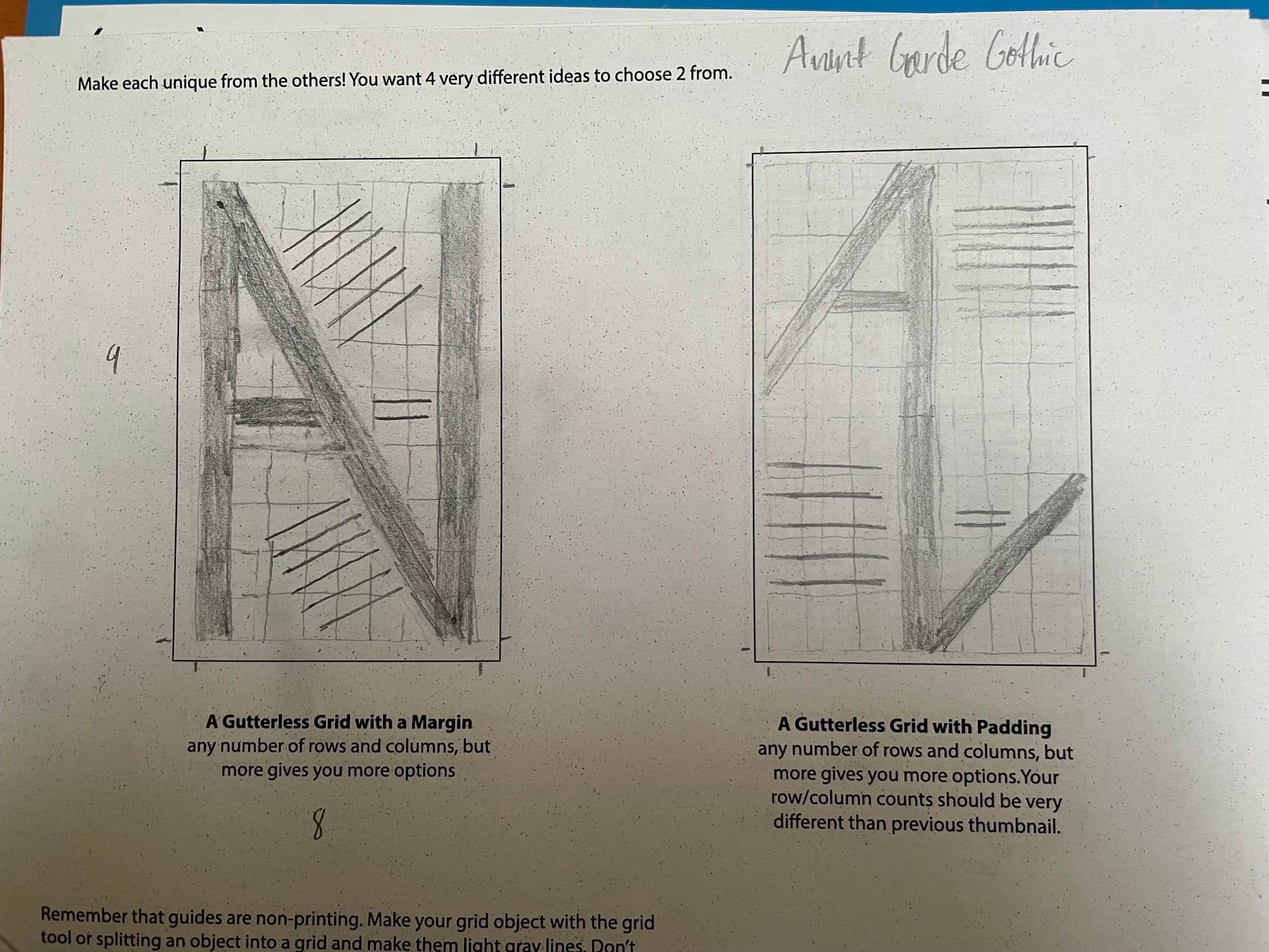
The third one is the closest to what I used for the final. It has the A and V ligatures side by side. This idea changed a lot as I moved to a digital interface with Adobe Illustrator, where instead of becoming one object, it became a pattern. The fourth one had a similar idea with The A and V ligatures connected via a single line, except here it went vertically. I thought the one going diagonally was visually more interesting.
Roughs:
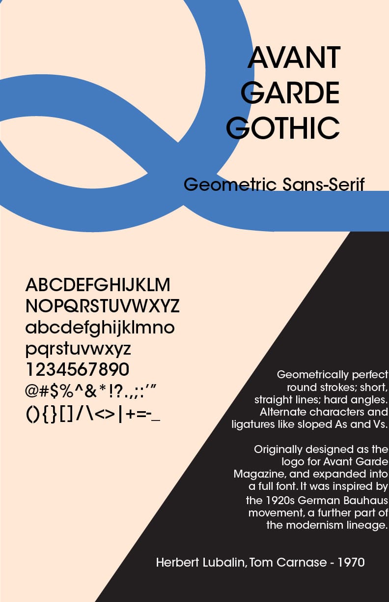
For this rough, I really liked the curved shape of the Q, and accentuated it by continuing the shape going off page. I also added the A ligature but filled in just to give more contrast on the page. I liked the color scheme I chose, it felt modern but grounded, though this is something the other people in my critique did not like. The poster over all felt a little flat, with not many elements, and other than the title which matched the circle of the Q, the paragraph and letters just sat on the page.
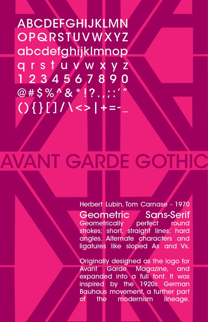
For the other rough, I took the V and A of the Avant Garde Magazine logo, where the Avant Garde Gothic font originates, copy and pasted it, and orientated it so it became a pattern.
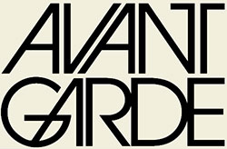
I then arranged that pattern and the title of the font so it kind of resembled an Art Deco facade of a building. The color scheme itself was dark but electric while still keeping a decent amount of contrast. The way the paragraphs sat, I tried making them blocks that balanced each other, but they did not present the text in an interesting way, and they got swallowed with the pattern in the background.
During the critique, for the rough with the blue Q, it was suggested that I made the paragraphs and text smaller, so I could introduce more hierarchy into the information that was being presented on page. They said I should expand the grid to try and do this. However, both people in my critique agreed that the other rough was better, or at least much more interesting.
For the rough with the purple pattern, I was told that the text in block forms wasn't working on the page, had bad contrast with the background going across the pattern, and had very little information hierarchy. For the individual letters, I was recommended to break them up. One of the other people in my group on one of their posters had each pair of letter broken up on its own paragraph, and strung around the page. I decided to try to do something similar with mine. The people in my critique also suggested to break up the paragraphs into smaller sentences, and try to arrange those with background.
Final Product:
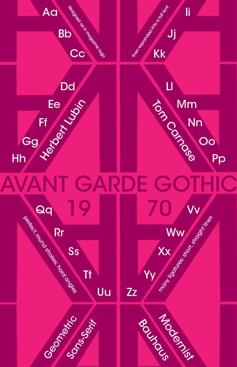
Little changed from the rough to the final product with the background and title. Everything changed with the text and information on the page however. For the individual letters showing off the qualities of the font, I arranged them so they moved along the diagonals, as if they were a guiding line. I also put some of the shorter sentences that described the font and its history into these diagonals as well.
I feel like this arrangement makes the poster much more dynamic, and it works with the background instead of fighting against it. There are parts that maybe feel a little too cluttered, but I think for the most part it works. With aligning them with the background pattern, it was hard to align everything with the grid. The title and edges of the pattern themselves are aligned with the grid, but then most of the other text is aligned with the diagonal pattern. The grid was still helpful in arranging the text so they stayed balanced and symmetrical with the design.
Overall, I find this design striking in a way that captures the revolutionary aspects of the Avant Garde Gothic font, and its lineage from the magazine that it comes from, both in its color and dynamic layout.